Mapping out the "social" in a social game
Chia-Heng Jen
Hi there!
I spend most of my days working closely with our game team to provide an extra layer of insight into what our players have been up to.
Sometimes however, I'm given the difficult task of explaining "why" players have done those things - and in order to help the game team understand I must find interesting and innovative ways to display the data.
In this digital age, all players are on social media and we know the time spent in games is higher but on social media, it’s higher. We want our game to meet the social needs of our players and become a world that people want to spend time in. We make social games.
"How social is our game?" is a question we ask ourselves a lot; and I decided some work was needed in order to clearly visualise how social each version of the game we make is - so that over time we can work towards improving it.
Industry standard tooling hasn't caught up to the demands of modern social games quite yet - most don't offer anywhere near the flexibility needed to support various cohorting, versioning & graphing strategies needed by high performing game teams. The best strategy right now, is to build your own. • Jen, Analyst at Netspeak Games (that's me)
To begin, we looked for tools and things that would support some of (or ideally) the following:
- Good templating
- Interactive graphs
- Easy to drill down
- Good customisation options
- Easy to share with the wider team
- Has python wrapper to feed the data in Very quickly the list appeared quite sparse, but we discovered a JavaScript library, D3.js.
Pros:
- Beautiful visualisation
- Interactive
- Flexible customisation options
Cons:
- Low level
- No well maintained python package for integration
An alternative is pyvis:
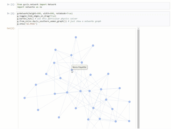
Pros:
- Good templating
- interactive
- Well maintained python package
- Flexible customisation options
Cons:
- Not easy to share with the wider team
I decided that even though (insert good thing here) it wasn't quite up to scratch. So I moved on to a more complicated system which involved combining 3 separate tools:
- networkX - “A Python package for the creation, manipulation, and study of the structure, dynamics, and functions of complex networks”
- Plotly - “An python package for creating interactive web-based graphs via the open source JavaScript graphing library plotly.js”
- Dash - A web app framework built on top of Plotly.js, React and Flask.
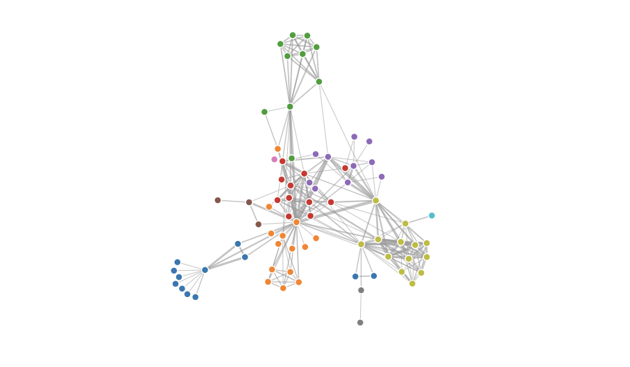
Very quickly. I was able to produce this:
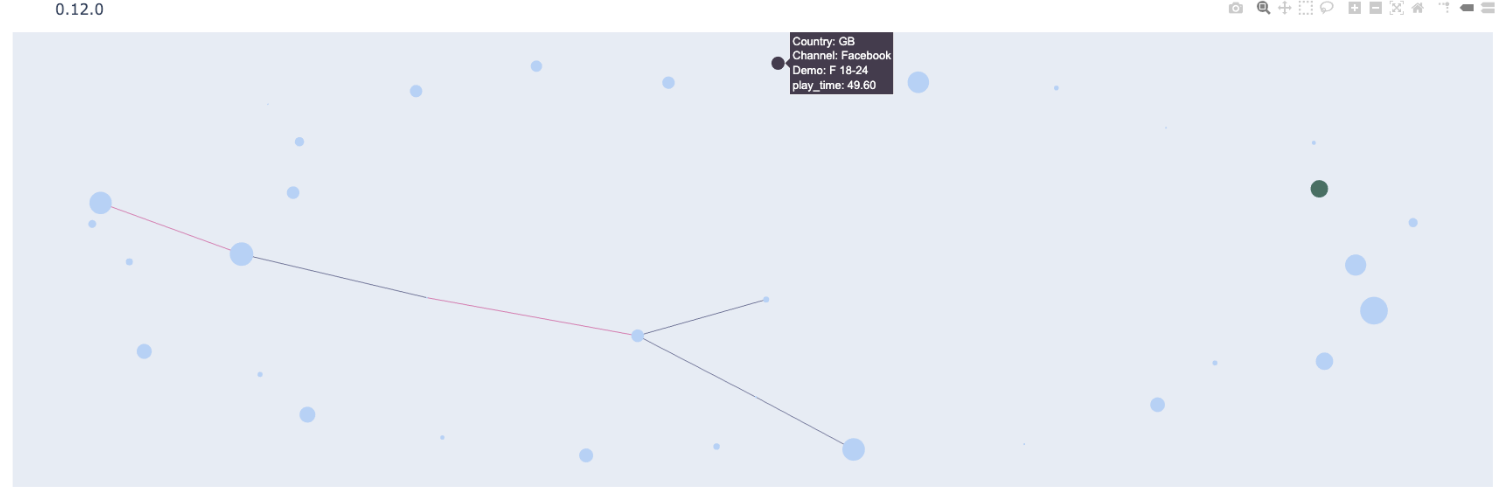
I showed this internally and got feedback. Over the last few weeks it has evolved into this:
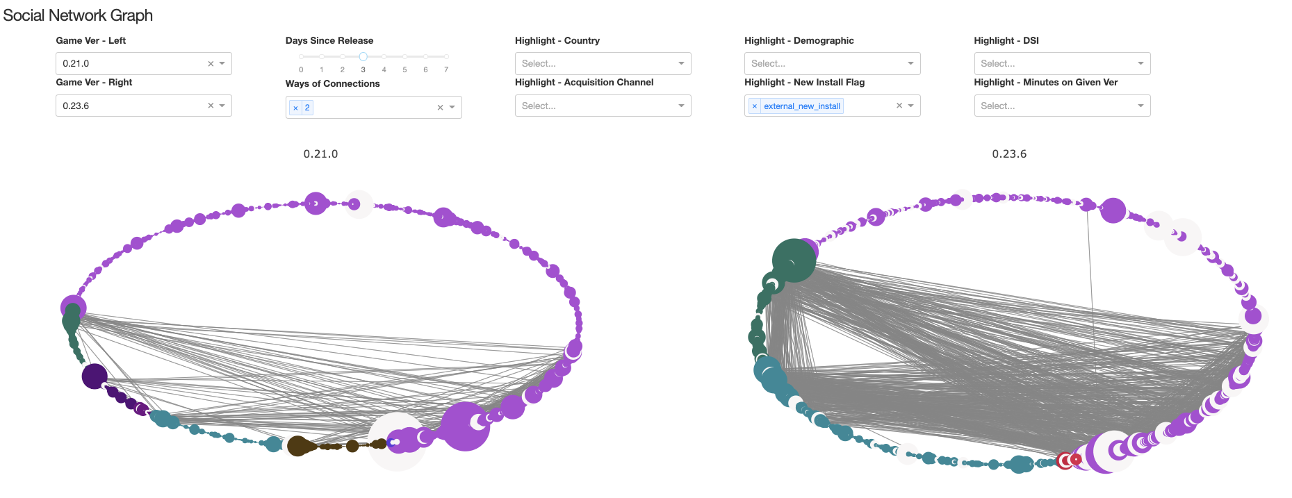
With this tool we can:
- Understand how likely players meet and friend each other
- Understand how likely players spend time with friends in the game
- Understand the correlation between engagement and social activities in game More importantly, the game team now can capture "how social" each version of the game is and compare - meaning we can now observe easily how socially impactful some of the new game features are. This has massively informed the design decision process @ Netspeak games.
We're really happy with how it works, and so we want to share - so here's a link to the open source which has instructions on building your own graph & some example test data in the repo.
Thank you for reading! 🐸
Netspeak Games Social Media: Linktree
Sunshine Days Social Media & Discord: Linktree