The Delightful Challenges of UIX
JJ Zumaeta
The world of UIX isn't the most glamorous in game development, even if it's embedded in nearly everything you do when you interact with the game. We got the menus, the buttons, the little things that allow you to engage with the game, and it's usually something that is passively enjoyed more than actively - people hardly give menus and buttons a second thought, but that's alright! Because that means we did a good job at making them blend seamlessly into the game.
Now, even if some UIX work is repeating patterns and templates to keep consistency, we often bump into challenges that appear simple initially, but when we get into it, we find out it's a whole lot more complex than expected.
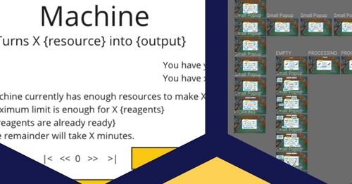
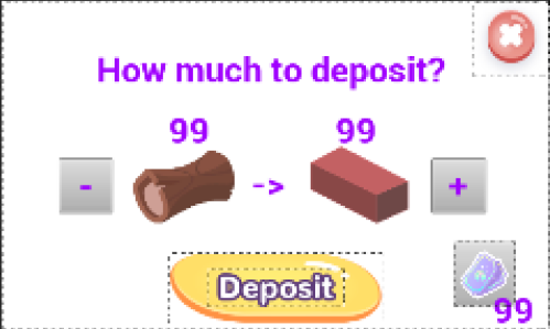
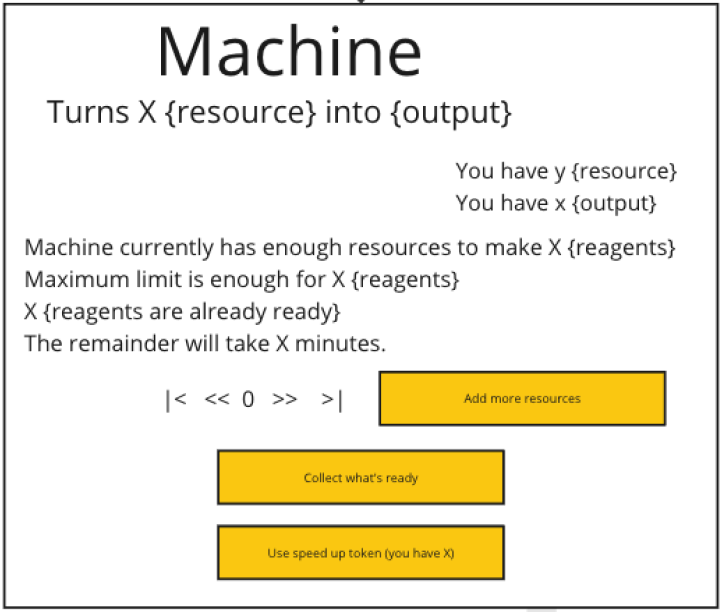
Recently we had a simple task: design a small pop-up for little machines in which you input a certain material and collect a different one after some time. Seemed straightforward enough: a space to toggle the amount of input up and down, another to show how much you'll get from each amount, and buttons to confirm the input and collect the output. Something simple like this:
However, when we started asking ourselves questions about the player's experience, we began noticing it wasn't that straightforward. How does the player know how much of each item they already own? How do we differentiate that information from how much of each item they put into the machine? How do we communicate that the machine is full and cannot take anymore input? If it's not full, can the player add more resources while it's processing a previous input? How do we show how much time it'll take? How do we allow the player to speed it up? So the complexity grows.
The information needs to be clear, simple, easy to absorb, and the pop-up mustn't be disruptive or difficult to use. If you have to think twice about how to use it, that means we still have some refining to do. And that's alright, because we love a good challenge! So we go and try different ideas over and over and over again, making sure we're covering every scenario possible, so that people can have a smooth experience.
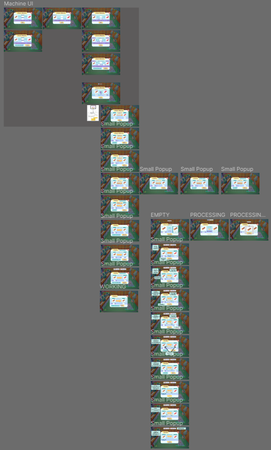
It's usually like this: the simpler the outcome in interface, the more complex the thought process behind it. Hope you like it!